Replacing iconic provincial park signs blow to Saskatchewan’s heritage
Over the last few months, Saskatchewan residents have noticed that their beloved brown provincial park signs have been replaced with new, blue park signs (left). The change is seen by some to be an erasing of Saskatchewan’s individual identity. Photo credit Dale Dunlop/The Maritime Explorer
The vast sky stretches endlessly across a tranquil morning on the Saskatchewan plains, casting its gentle glow over the province’s wheaty underbelly.
For lifelong Saskatchewanian Julie Maier, this beauty is part of what makes the province unique. “Saskatchewan can be a hard place to live, with weather and isolation,” she reflects. “But I think if you’re patient and willing to look [...] there’s a lot it can reveal to you.”
Outsiders might see it as just a flat, monotonous expanse of land. To those who call it home, though, the Prairies offer a deep-rooted sense of place.
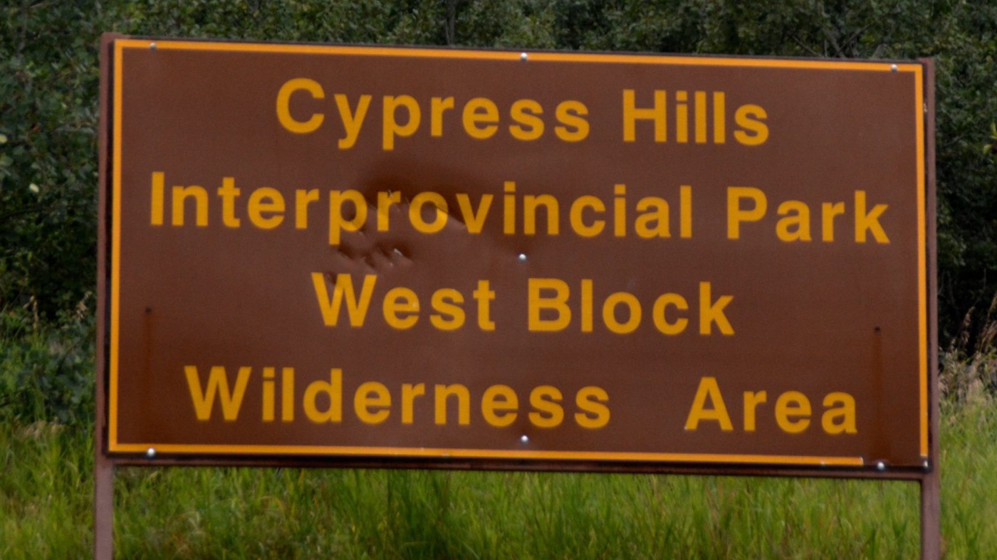
For decades, that beauty has been quite literally pointed out by the iconic brown and gold provincial park signs dotting highways. With their nod to the provincial flower, the western red lily, they stand in contrast to the sea of blue and green road signs across Saskatchewan denoting gas stations and highway exits. Brown means something entirely different: it’s that blissful charm of sepia-toned ‘70s summers.
Over decades, these signs have come to symbolize the province itself: quiet, enduring, and deeply rooted in their landscape. Even though brown signs, more generally, are recognized as “sites of public significance” in various countries around the world, Saskatchewan’s brown is different. It’s the shade of soil, the same colour as the beaver and white-tailed deer on Saskatchewan’s coat of arms. The ochre typeface and sign’s border is the same hue as that golden lion’s, said to represent the province’s wheat.
Now these much-loved signs are also disappearing far and wide. While the official sign replacement policy was initiated in August 2020, the rollout has been slow to date. It’s up to each provincial park to submit an application for new signage, and the replacements are only just gaining traction.
Maier immediately noticed when her beloved Blackstrap Provincial Park sign had been removed, with a sterile, unoriginal, blue and white version erected in its place. It’s unclear when exactly this happened, but the province’s Park Signs webpage was first updated with the new signs in July 2024.
“I found it strange at first,” she said. “I’ve always had a fondness for the old design. There’s something fantastically retro about it.”
Why now?
The official rationale for the change – that the new signs have better legibility – is reasonable. Even so, it’s unclear why the replacements couldn’t retain more elements of the old design, and help preserve a semblance of connection to the past while embracing modernization.
It would have been entirely doable, especially given the previously-used gold and brown tones were recognized as accessible. Colour contrast plays a crucial role in design legibility and while the new blue-and-white versions have higher contrast than the vintage signs, the original colour scheme was still above accessibility standards.
It feels more like political propaganda than a harmless modernization of the old design. Where does Saskatchewan end and the Saskatchewan Party begin?
There’s also something to be said for the signs we already have on the road and the information associated with them. Green signs are directional markers, informing travellers of upcoming towns or cities and the distance still to go, while blue and white signs typically denote services, rest stops, or local attractions, and brown signs have been for provincial parks. As one commentor on Reddit stated, “If they want to change up the sign color to be more modern fine, but don’t lump them in with miscellaneous [information] like gas stations or temporary attractions. Give them their own branding.”
Progress, or political symbolism?
When we zoom out, these changing signs clearly reflect a broader political trend. The transformation of Saskatchewan’s iconography is taking place in a manner which maintains little, if any, of the original marks of Saskatchewan’s past.
For instance, in 2013 the Sask Party modified the original Saskatchewan government logo from its iconic wheat sheaf into a modernized, stylized version that more closely resembles the party’s own logo.
The old logo, benign and apolitical, shifted into imagery, and using colours, that more closely entwines the province’s identity with the party’s. It feels more like political propaganda than a harmless modernization of the old design. Where does Saskatchewan end and the Saskatchewan Party begin?
Collectively, these cultural sideswipes are at odds with what Premier Scott Moe claims he envisions for the province, as a “nation within a nation.” These decisions made under his government are fostering a culture of precisely the opposite, in effect homogenizing Saskatchewan to blend in with the rest of the country.
In an interview with Dale Eisler, the former counsel general for Canada in Denver and author of From Left to Right: Saskatchewan’s Political and Economic Transformation, he remarked that sign colours have often aligned with the party in power.
Erasing cultural symbols and key elements of Saskatchewan’s heritage in favour of benign, corporate alternatives will undeniably risk eroding the province’s identity.
“During the NDP government years, orange and brown became a common colour. During the [Progressive Conservative] government years of the 1980s, blue became the dominant colour.”
The Government of Saskatchewan website reflects this too. Records from early in 2007 show it was a muted shade of blueish grey, right up until the Sask Party came into power that year, when it became significantly more yellow and green.
As Annie Hylton writes for The Walrus, “Moe has successfully inched Saskatchewan politics further right – with extreme climate, LGBTQ2S+, education, and economic policies.” She quotes Ian Hanna, a former communications adviser for former Premier Brad Wall, who says the Sask Party is moving towards becoming “a solid right-wing populist party, led by a right-wing populist guy in the form of Mr. Scott Moe.”
From the “emergency” passage of Bill 137, requiring parental consent before a child can use a different gender-related name or pronoun at school, to expressing that he “mirrors“ Trump’s concerns on immigration – Moe has indeed taken some clearly conservative stances. Eisler noted that the new blue signs could be an homage to the Conservative party’s usual colour of choice. “No doubt, the Moe government sees blue as subliminal messaging.”
And perhaps it’s only been a matter of time, given the Sask Party’s guiding principles are traditionally conservative. For instance, the party prioritizes a “smaller, less intrusive” government – which is a core belief of the federal Conservative Party of Canada’s constitutional framework.
According to Moe’s keynote speech at the 2024 Saskatoon Premier’s Dinner on June 13, the Party’s core message and objective is that of protection.
In a passionate address, he insisted “we are not going to let forces from inside or outside this province attack or tear down. We are going to protect what you and your neighbours in our communities and industries have built.”
Erasing cultural symbols and key elements of Saskatchewan’s heritage in favour of benign, corporate alternatives will undeniably risk eroding the province’s identity.
The big picture
Javier Gimeno-Martínez, design historian at the Vrije University Amsterdam, and author of Design and National Identity, explains that such minute changes are integral to the wider trend toward globalization, where local identities are increasingly subsumed by more generic, globalized standards.
“When a community loses a symbol that has been part of its identity for a long time, it can create a sense of loss and disorientation,” Gimeno-Martinez explains. “People may not realize how much these symbols mean to them until they’re gone.”
“Communities construct their identity through visual elements like signage,” Gimeno-Martínez notes. “When those elements are standardized, it can feel like an erasure of local culture.”
As he points out, the removal of familiar symbols can have a profound psychological effect on a community. “When a community loses a symbol that has been part of its identity for a long time, it can create a sense of loss and disorientation,” he explains. “People may not realize how much these symbols mean to them until they’re gone.”
While it might seem easy, and perhaps tempting, to dismiss these sign replacements as a fairly benign decision, Maier didn’t mourn the old park signs in isolation. Taking to X, she highlighted her personal disappointment. She also lamented the change as a real “aesthetic downgrade.”
Her thread struck a chord among Saskatchewan residents, many of whom were shocked and just as demoralized. As the likes flowed in and her post was shared on Reddit many others shared anecdotes of childhoods spent camping just behind those very park signs. One comment reminisced that they just “made me happy, for whatever reason.”
Her social media post has raised the type of heated responses that Maier wasn’t necessarily expecting. In retrospect, she thinks the post’s virality was the result of a “collection of things people are annoyed about.”
Proof of how people resonate with this iconography is evident. Hardpressed, a Saskatoon-based clothing brand, and Rebellion Brewing Co. in Regina have both profited off the famed provincial signage. Whether it’s nostalgia or a sense of identity, the signs are cultural icons folks are eager to pay for.
The global pattern
To be clear, this form of design deletion isn’t just happening in Saskatchewan.
The Paris Métro is famous for the few remaining art nouveau signs which adorn some of its lucky stations. Designed by Hector Guimard from 1898 to 1900, some signs were replaced during a modernization campaign after the First World War, and more were torn down for scrap metal during Second World War.
Guimard’s creations resembled the real earth. Not only did they look like it, they were made of it: the signs are made of glazed lava. The subway entrances feel organic, and they are.
In the words of Steven Zucker, former chair of art and design at the Pratt Institute, it is as if the signs are “held up, suspended between two plant-like stalks” which “look as if they’re budding – except that the blossom, which is yet to open, is actually a lamp.” And then there’s the typeface, with its playful and unfurling script. The gothic font still prevails across 86 locations, but many have been replaced with a significantly less distinct alternative.
While Saskatchewan may not have the global stature of Paris, it shares a similar vulnerability: in the pursuit of sameness, something essential is being lost.
For Paris, the metro’s more simplistic signage replacement is undeniably an artistic loss, but the city has plenty of other cultural symbols to rely upon to maintain its heritage.
Saskatchewan, on the other hand, derives everything from pride to profit from its prairies and parks. The park signs are crucial to solidifying that identity. Around one million pairs of eyeballs soak the signs in every year, drawing up their own interpretation and meaning of the place.
While Saskatchewan may not have the global stature of Paris, it shares a similar vulnerability: in the pursuit of sameness, something essential is being lost.
Gimeno-Martínez adds that plenty of objects and graphics go unnoticed until they’re under threat. This can signal a shift that feels imposed on the communities most protective of the identity at stake. He observes that even though some parts of the community may be fine with change, others may interpret it as an “attack on their identity.”
Perhaps this has to do with the feeling that these signs are not just a part of our environment, but a reflection of it. The earth-like Saskatchewan signs, and plant-like Parisian signs, feel more like they belong. Maybe they help us feel we belong in that environment too – as if we can be a part of it, not just take advantage of it. For Parisians, this might have been a longing for their pre-war era. For Saskatchewanians, perhaps it’s an internal conflict with a deeper political strife.
This phenomenon underscores the deep emotional connection people have to everyday symbols that might otherwise be overlooked until they’re gone, or in jeopardy, as is the case with these iconic signs.
The path forward
There was undeniably a way to update Saskatchewan’s park signs without erasing what makes them special. As Gimeno-Martínez points out, “It’s not about resisting change – it’s about ensuring that change doesn’t come at the expense of identity.”
If Saskatchewan is to remain a place to which its residents feel deeply connected, its symbols, its signs, and its history have to be maintained and respected.
The province’s modernization efforts could have coexisted without extinguishing its unique cultural markers. More decisions that favour standardization over individuality will put the province at risk of losing its distinct character. If Saskatchewan is to remain a place to which its residents feel deeply connected, its symbols, its signs, and its history have to be maintained and respected.
In Maier’s words, the signage is about “that feeling when you’re entering the park. You’re approaching the moment when you’ll get your campsite down, crack that first beer, and start a fire - that’s all part of the sign. You’re almost there.”